English
 Bahasa Indonesia

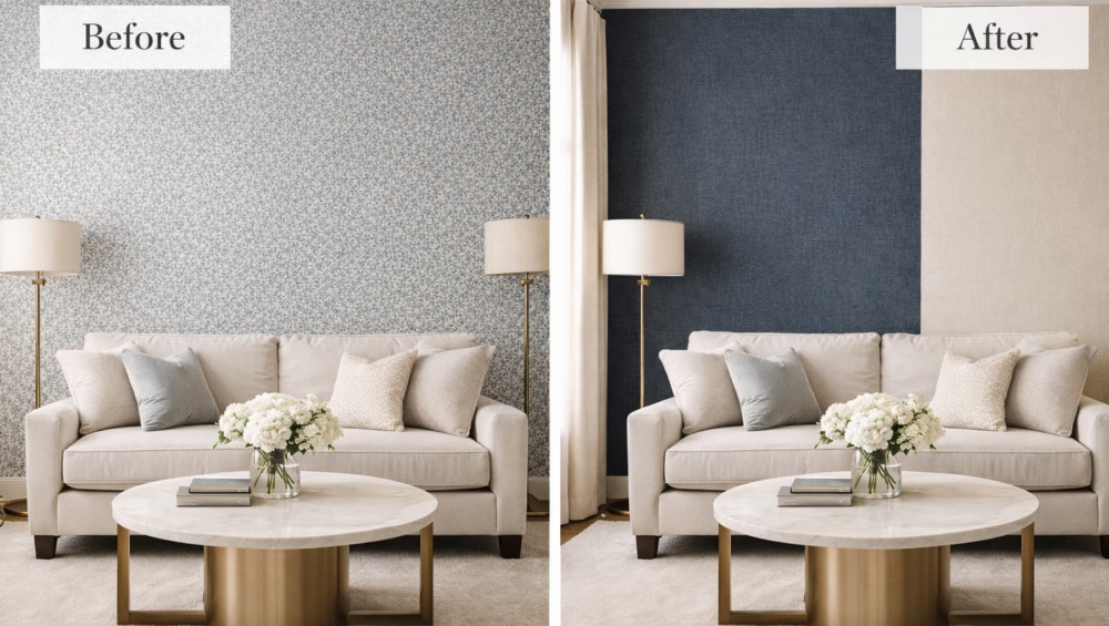
Most homeowners mistakenly believe that “luxury” means filling every square inch of a room with expensive patterns. Actually, a room covered entirely in bold prints often creates “Visual Fatigue,” making the space feel chaotic and exhausting. Instead, true high-end design relies on the sophisticated relationship between a striking Feature Wall and its Coordinated Plain Wallpapers.
At Home Decor Indonesia, we analyze interior styling through the lens of Optical Balance and Spatial Dynamics. Specifically, you must create a visual dialogue between the loud and the quiet elements of your room. Therefore, we designed this guide to help you master the art of pairing without the headache.
1. The Anchor Principle: Choosing Your Feature Wall

Primarily, you must identify the “Hero” of your room. Usually, this is the wall behind your headboard or your luxury sofa. By selecting a bold pattern for this specific area, you establish a clear Visual Hierarchy.
Actually, a bold pattern commands the eye’s attention immediately. Consequently, if you place patterns on all four walls, the eye finds no place to rest. Therefore, we recommend choosing a high-GSM (heavyweight) wallpaper with a complex motif for just one side. By doing this, you define the “Atmospheric Volume” of the room without suffocating the inhabitants. Ultimately, the Feature Wall acts as the anchor that holds the entire design narrative together.
2. The Science of Coordinated Plain Wallpapers

Once you select your bold pattern, you must find its “Silent Partner.” Actually, many people simply use white paint for the remaining walls. However, this creates a harsh, “unfinished” contrast that looks cheap. Instead, we recommend using Coordinated Plain Wallpapers that feature a subtle texture.
Specifically, look for a secondary color within your bold pattern. If your feature wall has deep emerald leaves with gold veins, choose a plain wallpaper in a soft, muted gold or a moss green. Furthermore, pay close attention to the texture. By choosing a plain wallpaper with a “linen” or “sand” finish, you allow the wall to catch the light in a way that paint cannot. As a result, the transition between the pattern and the plain wall feels intentional and expensive. Ultimately, the companion walls support the hero without competing for the spotlight.
3. Creating a Fluid Visual Dialogue

Furthermore, successful design requires a constant visual dialogue between different surfaces. This means your furniture, floor, and walls must “speak” the same language.
Technically, we use the 60-30-10 Rule to ensure balance:
-
60% goes to your Coordinated Plain Wallpapers (the foundation).
-
30% goes to your Feature Wall and secondary upholstery.
-
10% goes to your “Pop” accents (cushions or art).
By following this ratio, you ensure that the bold pattern feels like a curated choice rather than an accident. In addition, consider the Luminous flux distribution in the room. Specifically, place your boldest pattern on the wall that receives the most natural light. Consequently, the sunlight reveals the depth of the print, while the textured plain walls absorb the excess glare. Thus, you achieve a harmonious environment that feels both energetic and incredibly serene.
Conclusion: Balance is the Ultimate Opulence
Ultimately, mastering the Feature Wall involves more than just picking a pretty paper. It requires a technical understanding of how different weights, textures, and colors interact. By pairing bold motifs with Coordinated Plain Wallpapers, you create a home that looks like a professional designer’s masterpiece. Therefore, stop settling for “busy” and start designing with balance.